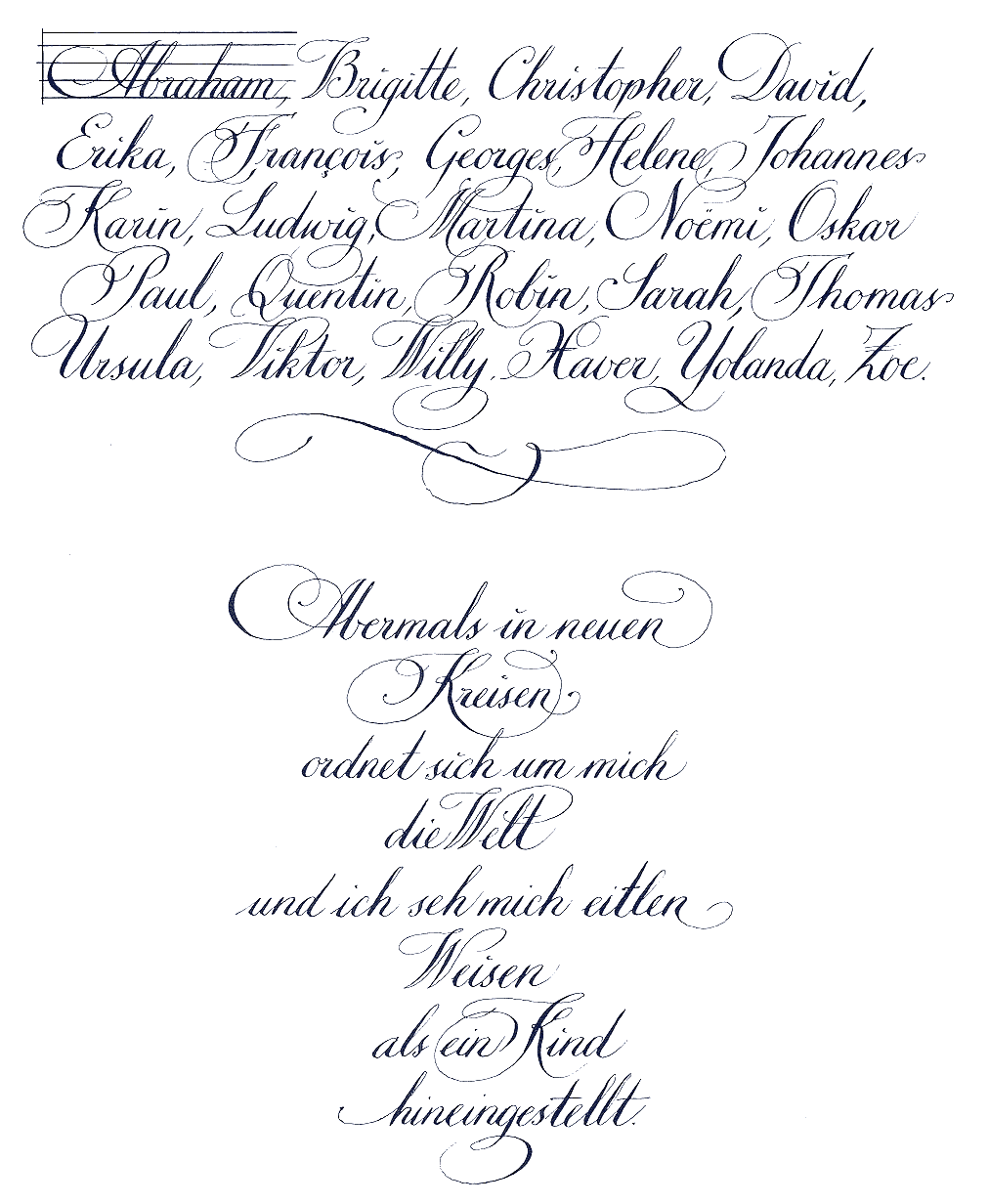
Again. I used to pretty much ignore the little "ink" tool in TheGimp, but it turns out that it's possible to do very shaky calligraphy with Gimp and Crocky's tablet. I'm not sure if it's worth bothering, though - the tablet doesn't translate the pressure I use very faithfully and accurately, and thus my result is pretty blotchy, which is probably due to my lack of experience than the tablet, though.
The result looks pretty much like all my first steps with a new tool - blotchy, uneven, an inky mess. The only upside to this is that I don't get inky fingers from this, the downside is that I'm not sure if I can improve.
It's about as hard as my first steps with hand-cut goose quills (having hunters in the family has its perks), and those never took off and I gave up pretty quickly and returned to metal nibs.
Edit: look, my crack at Hartmann's
Der Arme Heinrich, copied from my copy of the Heidelberg manuscpript (Ba), which looks
like this:

See? Blotchy. This is so much easier on paper, though the ability to just press the "undo" button when I get things wrong has its appeal. Still, it feels like cheating.